Virta — the digital platform for electric vehicle charging
As electric vehicles (EVs) are becoming the standard automotive solution, the necessary infrastructure needs to be built. Virta, Europe’s fastest growing EV charging platform, collaborated with Nordkapp to revise their management tools for B2B customers to make them a competitive advantage and one of the driving forces behind their stellar customer experience.
Virta has a clear mission — to solve the climate crisis by bringing electric mobility to businesses, people’s everyday lives and the energy system. Virta’s digital EV charging platform connects all the key players in the electric vehicle ecosystem and provides services for the whole value chain in over 30 countries around the world. Virta makes it easy for EV charging businesses to thrive — offering charging business as a service on top of their turnkey software solution. Virta takes care of all the complexities of running an EV charging business from charging devices to end-user services and smart energy management.
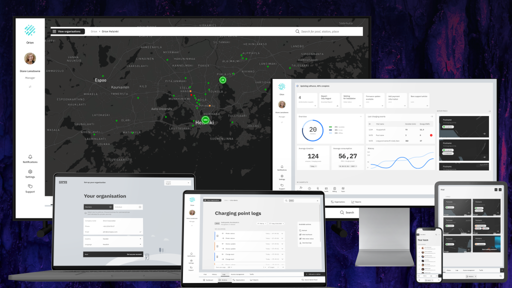
Building a charging network is about the interplay of many actors. End-user contracts and billing need to be arranged, charging points need to be installed and managed, and users need to have a functional interface for charging their car. To help make this collaboration of various actors efficient and easy, Virta decided to boost their customer-facing tools by refreshing their entire platform’s interface. Virta’s B2B customers use the platform to view and manage their EV charging network, from overall systemic view to individual sessions, charging points and customers.

The challenge
Virta’s management software — or platform — has always been the practical interface for addressing customers’ key needs. Before establishing the challenges with the tool, let’s first establish the key EV industry roles that Virta’s business deals with:
- Charging point owners (CPO) &
- Electric mobility providers (EMP)
It is important to note that the size of a CPO can vary from a large organisation that owns & operates a network of stations, to private owners who own a few or even a single charging point at their home for personal use. In certain cases CPOs could also be playing the role of the EMP by providing themselves access to the charging equipment to their users (employees, visitors, customers etc.). The system therefore needs to consider a wide range of customer organisations with varied needs. While some professional organisations may have dedicated resources to deal with EV charging and complex software panels, most will be providing charging services as an addition to their core business and have the highest need for a great UX. This is because they don’t have charging experts in their team who can use time to learn how to use a more complicated system.
Virta’s platform had evolved with new features being added as the need came up. Over time, this added towards the complexity of the entire interface, thereby increasing the load on training, additional manual work for operators & customer support requests. Additionally, as the primary sales tool for the organisation, the Virta platform was to stand out as a forward-thinking solution to potential clients managing EV networks and the future-proof foundation to build their services on.
For existing clients, an overhaul driven by user needs would help fully utilize the rich feature set Virta offers to their clients. This, in turn, would help drive down the number of support contacts.

Goals
As with all evolving services, constant adjustments to user-facing feature and design are needed to ensure simplicity and coherence throughout the service. Funnily enough, one of the first tasks for the team during the early stages was to print the existing architecture of just one module, and simplify it. What was in front of us, was over a meter’s length, and unanimously, we agreed that starting from a clean canvas and building it from ground up is the way forward.

Our common goal was to simplify to the core & make the interface beautiful and smart. Modularity was also a must-have to accommodate customization according to the needs of different organisation types and user roles. This meant the ability to show different features to different user groups (roles), the capability to easily add new features and the possibility to customize the look and feel with light customer company branding.
To future-proof the software, the redesign would need to be carried out in a way that would support further development. As Virta’s teams and customers specialize in specific expertise areas, the software had to have the capacity to become an ecosystem where they could all strive and evolve.
Our approach — how did we do it?
Our approach was to work by embedding our specialists in the customer teams. With Virta, Nordkapp led the design of the new platform, working closely with Virta’s Product team & development partners. This was consistent through the entire process to enable sharing of ideas, ways of working, and best practices to ensure continuity and open collaboration.
User-research
With clear goals in mind, it was important to validate our assumptions from the customer perspective. We started with user research comprising of stakeholder & customer interviews to understand the pain points and potential for the system overhaul. In parallel, the design team was onboarded on various complex domains and topics with the support of Virta’s own team to understand the service itself intimately. After synthesising the research data and early conclusions, the project moved forward to a design-driven gear. In contrast to designing a consumer facing product, designing a B2B product relied heavily on sales targets, business goals and most importantly, the knowledge from the domain experts from Virta & their key customers. Coupled with research, the team already had everything necessary to revamp the platform.
Design
A practice that led the process through the course of the collaboration between Nordkapp and Virta, was to derive design hypothesis in war-rooms, whiteboards & ample sketching. Emilie Calmettes, the Product manager at Virta, almost filled the role for an Interaction designer on the project as she would naturally doodle process-maps, breaking down components, interactions & dependencies with much detail and clarity to facilitate communication. This worked refreshingly well for the entire team as we were able to spar & make decisions quicker, without spending precious hours pushing pixels as a starting point.

Once we arrived on a hypothesis, the design team would mockup the user-flows into high-fidelity interactive prototypes. This would be presented early-on to developers and for gathering feedback via Virta’s internal demos. This approach set the expectations for quality, the promise of performance in the real world, corrected inconsistencies and also acted as a reality check — what can be done, and what not. These would be then be finalised and go into production, while the design team would prepare to repeat this process for the next part of the platform.
Below is one such example of showcasing the stations interface demo — to test & validate that complex information and controls can be made usable on small screens.
The design drivers for building the platform were modular, contextual, simple & intuitive. We defined four user roles based on our research and tailored the experience of the interface to cater to their needs. This user-driven approach allowed us to highlight the most important features for them while leaving the complexity behind. As our first task, an introductory onboarding to the platform was created for first-time users.

Continuing forward, we investigated the range of customisation that the platform would provide. Providing end user customisation in a key element of personalisation, however, if incorrectly implemented, it’s often a double-edged sword. We decided to move away from Virta’s own brand-language, to strike the balance for a truly white-label interface. For example, providing UI-customisation in any colour may easily conflict with important alerts or data-points. Similarly, extending Virta brand colours to customers may provide a trigger to request such customisations in the first place. For this reason, we made the decision to craft a neutral theme, that Virta could easily own and maintain. This was perhaps one of the most important challenges to tackle through designing the UI-product, while balancing brand-visibility — how might we balance the overall look and feel that is functional & universally accepted? Our design team heavily borrowed elements from pre-existing elements from Virta’s own brand to ensure cross-compatibility and we also studied approaches taken by world-class operating systems. As a result, a neutral brand language was born to suit some light customization and a design system for Virta’s platform equipped with its own motion & interaction language.

With its most common users ranging from technicians in the field to desk workers managing thousands of charging units, it was also important that the entire functionality of the Virta platform is usable on any screen size. A system of contextual actions removed guesswork and made usability simple, yet feature-rich without having to rely heavily on training and support teams. Below are certain examples showing context aware actions and micro-interactions that introduce intuitiveness and delight to the interface:
Design handoff
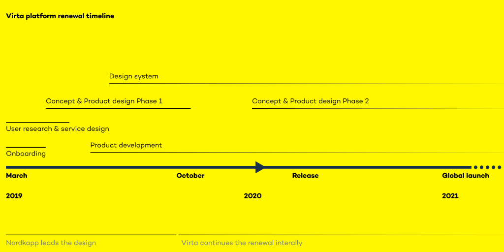
Nordkapp’s role as an agency and consulting partner was to provide maximum impact in the shortest time. With our interdisciplinary team of experts, we fulfilled that role in a span of under 8 months. We tackled the key tasks, dividing responsibilities with Virta’s own internal design team through the project and eventually planned a comprehensive handoff of our responsibilities and best practices. With a foundation in place, the design for the product has scaled and performed positively by far.
Technology & Development of the system
Building well-designed digital ecosystems is always a challenging goal from a technological perspective. One of the main requirements was to ensure the backwards-compatibility of any new platform features to the existing interface, which was still to be maintained and used by customers for the duration of the project and migration. As the design project started, Virta’s development team was already building the fundamentals of its future data management structure which would later support the different modules and user needs.


Results
Through the collaboration between Virta and Nordkapp already in the early stages of the project, we streamlined the platform and its development processes, ensuring it remains customisable and future-proof. By refreshing it, we connected various user groups in a meaningful way, introduced only the features each user group needs to see and made the Virta user experience a comprehensive whole.
The new Virta platform was released in 2020 and its global roll-out is planned to happen over the course of 2021, customer group by customer group. Both new organisations and historical customers have already been introduced to the platform and shared very positive feedback on the simplicity and clarity of its new interface.
The team
Virta
Emilie Calmettes, Project lead
Jeremy Däpp, Design
Ulla Mathaldi, Design
Masnad Nehith, Technical owner, back-end developer
Andrei Baranov, Back-end developer
Mohsen Hosseini, Back-end developer
Berkin Berkcan Çırac, Front-end developer
Łukasz Sawicki, Quality engineer
Nordkapp
Shakti Dash, Lead designer
Maria Lomakina, Visual & motion design
Valeria Goryachaya, Visual design
Heikki Savonen & Juhani Haaparanta, User research & service design
Aki Happonen, Front-end developer
GoFore
Antti Suuronen, Front-end developer
Panu Salmi, Front-end developer


