Since spring 2017, Veikkaus Design System called “Tandem” has been constructed in co-operation with in-house and consultant designers and developers.
What is a Design System and why is it topical?
As design teams grow bigger and digital services get more complex, there is a need to understand design work more systematically. Instead of solving a recurring design challenge every time in a unique way, approaching it systematically makes sense: it saves time, enables a coherent user experience and frees designers time to work on more meaningful design work.
What is a Design System in practice? Depends on who you ask, as the concept of Design System is very flexible. The answer may be anything from style guide to UI library in Sketch, or even tone-of-voice. The scope of the Design System also has a large variety, depending on the brand’s product portfolio and scale of digital presence. In short, Design System can be anything that enables systematic and efficient design and development work practices.

I a case of a small startup, Design System can take a form of a straightforward design template with color palette and typography styles, shared with a handful of designers. Maintained by the lead designer, this template can be the most efficient way to spread and preserve the chosen design language between team members.
In case of a large company like Veikkaus, the Finnish national betting agency, the expectations become greater. As the biggest web store in Finland, Veikkaus Gaming site requires an acting team of designers and developers to maintain the site and develop the gaming experience further. This team consists of around ten designers, 20 developers and a handful of content creators that can utilize the Design System, called “Veikkaus Tandem”.
From this team, a sub-team of a product owner, one designer and two developers, is dedicated to working on Veikkaus Tandem. How have we defined team’s objectives and tools to reach them?
Benefits of using a Design System
Enhance user experience
Better and unified user experience that creates competitive advantage for the company through systematic customer journey planning.
Streamlining of work process
Systematic work processes, reusable components and comprehensive documentation streamline the continuous development of a digital service.
Less confusion
Shared tools and common language simplify the work in a big organization. People call design components with same names and know how to pass work from one designer or developer to another easily.
Onboarding with less hassle
Comprehensive documentation and defined ways-of-working ease onboarding of new team members. It also creates an appealing work culture.
Creation of Veikkaus Tandem
Starting point
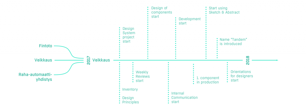
Veikkaus Oy started its operations at the beginning of 2017, as the Finnish gaming system was reformed and the previous three operators Fintoto, Finland’s Slot Machine Association (RAY), and Veikkaus merged into a single gaming company owned by the Finnish State. (1)
In April 2017 Veikkaus opened a new online store, offering all of Veikkaus’ internet and mobile games. The three customer registers and accounts were combined into a single customer account working with the same login IDs. (2)

From designs point of view, this naturally meant combining not only the styles but also user experience and working culture. Veikkaus had a style guide that was mainly used by developers, it did not guide design or content creation. But there was a problem: It lacked a person responsible for it, and so it had developed organically. Every time there had been a need for a new component, it was added to the style guide without any review. So in the end, the style guide was a massive library but lacked a vision of good user experience. And it was used by over 40 developers.

Foundation
So, to be successful, Design System needs a person dedicated to developing and maintaining it. This requires skills and vision, but mostly time, passion and perseverance. On top of this, it is wise to set a team of developers to work only on the Design System.
We started with a design inventory done by the Service Design Team. The primary goal was to “see the big picture”, have a sense of the work ahead of us, and clarify the needs and objectives of the work. We detected all inconsistencies in UI’s that needed a consistent look and feel. We listed them, prioritized the foundings.

Design Principles
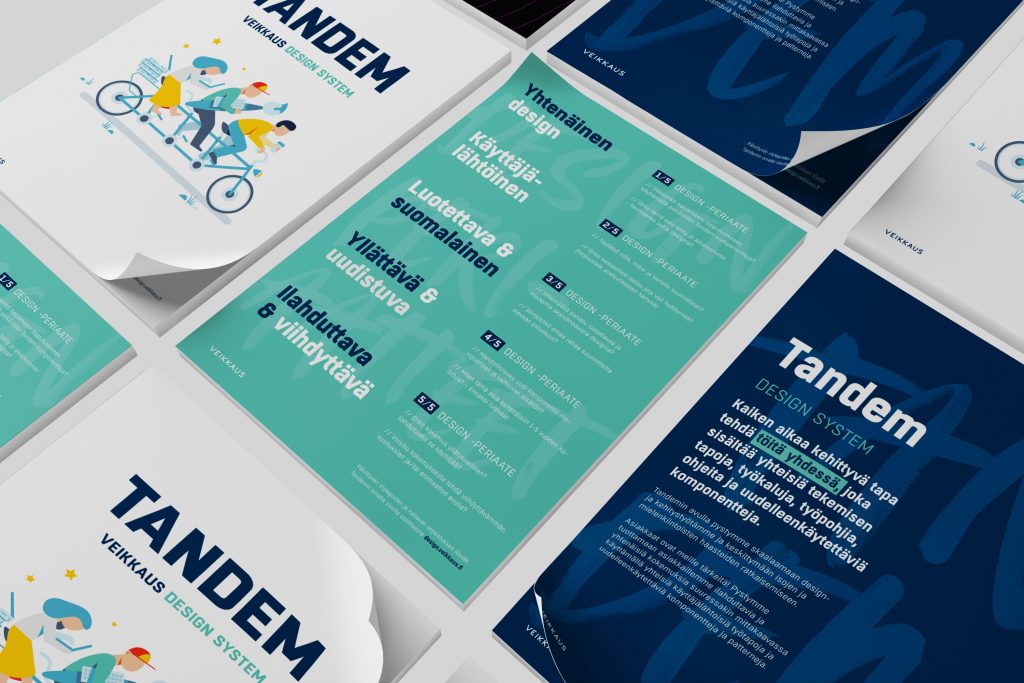
While doing the inventory, we also decided on the design principles that would guide our work. Starting with Veikkaus brand values, we fitted them to service design environment. These principles are the backbone of the design, it guides the design decisions made while working.
Templates, documentation, and design.veikkaus.fi
Now it was time to do some practical visual design work. We started with a Sketch template that consists of all foundation guidelines: Spacing, color palette, typography, iconography, and grid system. By defining these foundations, we keep the design consistent even when there is a big team of designers with different backgrounds working on Veikkaus Gaming site.

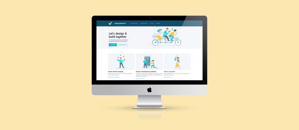
Principles and foundations as well as design culture definition is shared with design.veikkaus.fi. This is a platform open to all designers and developers in the team. They are shared in form of texts, images, animations and code. It is so called “living styleguide”, so any changes to styles made here will affect the live site.
Development of the ecosystem
The very objectives of Tandem is to make design and development work more efficient. Since we are dealing with a live site, also Tandem need to evolve. We think of it as more of a process than documentation. We have identified four main tasks for Tandem development:
- Design, documentation and testing components
- Technical Implementation
- Weekly Reviews
- Deployment, support, and communication

1. Design, documentation and testing components
After the first inventory and set of components, there is off and on a need for new components. Although these requests are examined critically, there are new components to be designed. This design work consists of UX design, visual design, and animations to all states of the component.
One of the cornerstones at Veikkaus is a data-driven approach to design. So we have an ability to A/B test all components before starting to use them in the live site. The criteria are strict: the new component has to perform better than the previous one.
2. Technical implementation
This task can’t be overestimated – technical implementation is easily the most time consuming of all functions. At Veikkaus, we have around 40 frontend developers working on the gaming site. The primary objective of developers dedicated to Veikkaus Tandem is to unify the ways-of -working and to make reusable components available to all developers.
Tandem development takes place in a multi-vendor environment in co-operation with Veikkaus, Siili Solutions, RND Works and SC5.

3. Weekly Reviews
We can’t highlight enough the fact that Design System needs visibility in the organization. To ensure this as well as smooth and even progress, we are holding Weekly Review. They are open to everybody, and the agenda includes walk-through of all elements design since the last Weekly Review. We encourage participants to give feedback and we, in turn, try to help with any open issues. On top of Tandem team and anyone interested, Lead visual designer, UX lead and Head of service design are present.
4. Deployment, support and communication
Deployment of Tandem is a vast operation. The goal is to orientate all designer and developers to Tandem principles and to guide in everyday challenges with a hands-on attitude. Design.veikkaus.fi being the most important source of information needs to be available at all times. We also have taken the opportunity to tell about Tandem in all internal gatherings when invited.

Small but steady steps forward the roadmap
While we are looking into customer feedback and gathering data on site performance, we are pleased to see changes in the team’s dynamics and ways-of-working. With a common language and set of Tandem components, there is more room for cooperation and communication. We see one-man-show-designer attitude step back and give room for sharing, sparring and design talk which we love! Designers feel like they don’t have to start from scratch when starting a new project; there is a sense of continuation when using handy templates, guidelines and having talks with colleagues.
In the future, companies need to try out and create new services way faster that today. Like Airbnb design technology lead Benjamin Wilkins puts it: “The time required to test an idea should be zero”. This in mind, we expect a working Design System to be one steps towards that future.

People:
Design:
Melina Kukkasela (Head of Service Design, Veikkaus), Siina Tanninen (Design Lead, Veikkaus), Samuli Nivala (Senior Designer, Nordkapp), Sonja Krogius (Lead Designer, Nordkapp), Toni Karttunen (UX Designer / Software Developer, RND Works) ja Maria Lomakina (Motion Designer, Nordkapp).
Development:
Janne Remes (Senior UX Developer, Nordcloud), Juha Karttunen (Compentence Lead, Experimentation & Analytics, Siili Solutions), Tuija Latva (Senior UX Developer, Nordcloud), Petri Järvinen (UX Developer, Siili Solutions), Tobias Martin (UX Developer, Nordcloud), Heli Hintikka (UX Developer, RND Works).