Best customer experience with services made easy
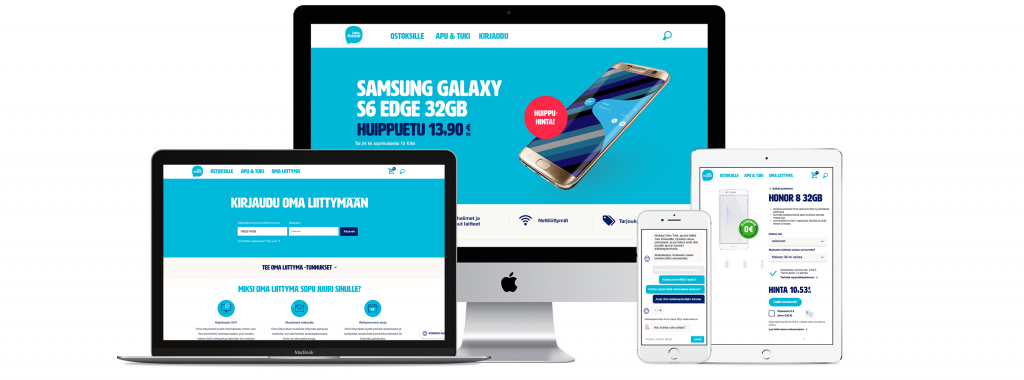
2016 was a major year of leveling up for Tele Finland. Several years had passed where digital services had done just smaller, incremental improvements. There was a need to update the website to fit a new responsive platform and it seemed like a good place to apply design thinking into the company as a whole.
Project started by setting up a Nordkapp team to the Telia Company premises which started to work as one with the customer.
In the beginning there were two goals:
1 – To design all digital services into responsive format
2 – To make digital services to live up Tele Finland’s mission, “Best customer experience with services made easy. ”

Building the fundamentals
Our design work started by creating a visual language and a digital brand styleguide for Tele Finland. The styleguide also worked as an digital asset library. As a framework we used the Atomic Design principle, and started to design reusable element libraries for the site.
We went through all the existing designs both digital and physical and started to align those. First we marked the elements we wanted to keep on using, then created list of those which needed to be re-designed. We worked all the way from the atomic level including smallest particles, such as buttons and input fields towards page templates and the actual site. During the process we also refreshed the Tele Finland brand language and visual appearance.
In the beginning we set up basics of the style including a color library, typography and a responsive grid. Based on that we started forming the atoms, molecules and finally the whole Tele Finland universe. As it always happens in these cases, one also has to proof the design with real content. That made some iteration rounds happen, and sometimes the style guide updated the layout and sometimes it happened vice versa.

Renewal of web site and store
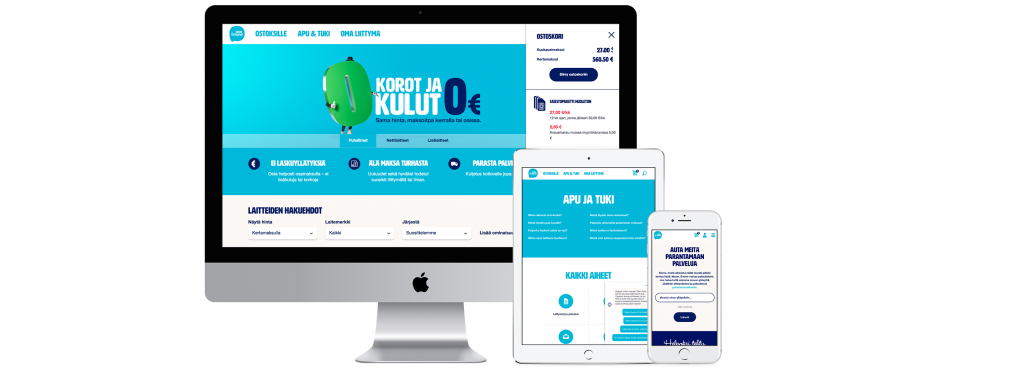
The first design task with the new style guide was to redesign Tele Finland web store. Since the web store hadn’t been updated for a while there were not just the need to make it responsive, but also to design the whole logic of the store. Once again keeping in mind the tagline “Made services easy” we figured out what was the easiest way to buy phones, devices and subscriptions for our customers.
Considering that Tele Finland’s customers vary from small children to the elderly – and everything in between, the core design principles were to make all the elements visible, texts readable and in general keep the customer on track of the purchase process.
We ended up making things a bit uncontroversial and run the first user tests when the web store was already launched. That way we were able to speed up the design process, and combine user test results with data from the analytics. To illustrate the agility of the process, during the launch we were actually improving the service together with our customers.
Customer service section was improved by co-creation with our customer service agents. The core idea was simple – all the content got reviewed and then compared with the data from analytics. Unnecessary content got stripped away and only the relevant articles and instructions were left. In case we missed something, we added a friendly feedback section to the site for customers to tell us what they would like.
In just a couple of months we had updated the user experience of the store, refreshed its visual language and tested it with users. It was time to take our learnings and use them to transform the rest of the website. Page by page Tele Finland’s site started to renew and find its current appearance. At this point the design sprints were quite fast and it was easy to hit the targets, thanks to our new brand styleguide.

Totti the Bot
After the big fundamental renewals it was time to think about some other ways to offer better service for the Tele finland customers. As many customer focused sites Tele Finland offered also a chat service at their site. Whereas the chat was very popular among the customers it had one drawback – it was open only during the customer service hours.
Tele Finland had won the best customer service prize in telecommunications field several years in a row. We wanted to continue that, while figuring out how the customer service could serve after hours.
We had an idea to improve the situation.
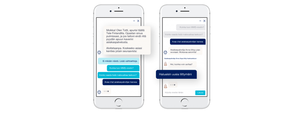
Totti, the bot at Tele Finland site is a happy customer servant who never sleeps. He’ll help customers along with the customer service staff. In the first phase Totti has been trained to solve simple questions and lead a way inside Tele Finland site. And if there’s a question Totti can’t answer, he’ll ask his friends from the customer service to help with. Our goal was to add some AI into the service.
Results
For us the most delightful results have been spontaneous customer comments on the site. During the renewal we added few places for users to leave feedback and it seems they have liked it – a lot. As expected mobile site visits increased 55 % after the renewal. In total the amount of site visits increased 23 % compared to the earlier half of the year. Also mobile conversion percentage increased a huge 18,6 % compared to time before renewal.
Totti the Bot, released in November already during its first months gained 13 235 sessions from the site visitors. And out of those approximately 2/3 find help through the bot without contacting a customer servant. Pretty sweet, if we may say so.
In addition to the great customer feedback, we also discovered a bunch of improvement areas that we have solved already and will continue on solving.
Reason? Tele Finland wants to always offer better service to their customers.
The average rating given to the site by customers is 4/5 stars. In most comments customers are pleased with the easiness, simplicity and clarity of the site and the purchase journey. Analytics told us that the the purchase process took 2 min less time than before the renewal.
Instruction of different buttons at Tele Finland styleguide.

Tele Finland icon set drawn by Vesa Sammalisto.
![]()
Extensive list of elements designed for Totti the Bot

Participating companies:
Customer: Telia Company / Tele Finland
Design: Nordkapp
Development: Houston Inc. Alda Media, Lekane