ING Beleggen
The opportunity
Taking the black magic out of investing
When it comes to trading and investments there are two kinds of people: smart minds that get it and the rest of us for whom trading is like black magic. The threshold to start investing seems so high that many people prefer to put money on a saving account even though we are aware that the interest rates on those accounts are barely existent.

ING’s purpose is to empower people to stay a step ahead in life and business. This can be seen in their services and products, such as their mobile banking app that is the highest ranked app of its kind in the Netherlands. With the investment app they didn’t want to compromise either so their brief was simple: “we want the best investment app in the world.”
They turned to us to make this vision reality. They wanted a product that lets their customers to perform their investing tasks in an extremely easy manner, as well as a product that lets ING support their customers regardless of place and time, both well above expectations.

Our approach
Understanding the users and co-creating solutions with them
To design the best app in the world is an ambitious goal. For us, there was only one way we could achieve it—by co-creating the product with the client and their end users.

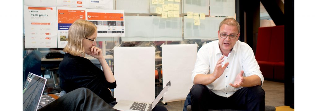
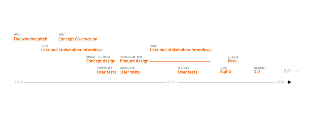
We began by moving our team in with ING in Amsterdam, where we had set up a war room. Being close to the customer helped us to learn their perspective and understand their brand throughout. We spoke with several stakeholders representing different areas of business inside ING. Through talking with them, we were able to distill a coherent vision for success that brought all the stakeholders onto the same page. We learned a lot about the realities of investing, and the perceptions and myths surrounding it. It became clear to us that ING truly wanted to empower people and teach them to be better in their wealth management.

The most important part of the process was to involve the users. We were in touch with them throughout the entire design process. We met with several ING customers and interviewed them about their attitude towards money and investing. We got to know them and their behaviours, not only when it comes to investing but also their daily routines and social life. This work allowed us to build behavioural user archetypes that lead the design work for this app and was also adapted by other teams.

We ended up with four behavioral archetypes that can overlap and evolve over time, as a person moves through life and learns more about the financial markets and about managing her wealth. At the same time, design principles that overarched the entire project started to emerge.

When it came to ideation, in a true co-creation manner, we had gathered all the important ING stakeholders, designers, developers as well as ING customers, for a two-day intensive workshop. During this workshop we used different service design methods and worked in teams to come up with ideas that would not only meet but also exceed customers’ expectations and ING business objectives.

Outcomes of the workshop gave us a lot of new ideas as well as refined existing ideas, that we could continue developing further. We worked closely with the ING team to distill all the insights and to shape the ideas from the workshop into a strong concept. This work helped us create a continuous roadmap of improvement and innovation for the future of the product.

Once we had started the detail design process we continued to include users in the process. In order to communicate our ideas best we designed and prototyped all the functionality and tested it with end users, both ING customers and non-customers.
For us, design is not only about how it works or looks but also about how it feels. Therefore, we paid extra attention to the motion language of the product. We aimed for an animations that aid the user to complete tasks and at the same time provide a delightful user experience.
During the entire detail design process we cooperated in close proximity and in an agile manner with the ING development team to make sure that the quality of the product wasn’t compromised and that our designs were implementable.

The results
Investing made everyday and approachable
We set out to design something simple, empowering and easy to use: a product that turns everyone into an active wealth manager and a product that makes investing everyday and approachable.
The ING Beleggen app provides the user with the information they really need: a look into their portfolio clearly shows their performance at any given moment, a possibility to observe instruments in order to find the optimal moment to purchase and an insight into the financial markets and into other instruments. Also, ordering and selling instruments is made simple, sleek and the product intuitively guides the user throughout the process.
The app has two distinctive modes: browsing and purchasing. The modes differ visually to aid the user in distinguishing the task they are about to complete. The browsing mode is light and allows the user to freely navigate throughout the entire app. The purchasing mode is a focus mode where the user either completes the purchase or cancels the order. Making a stock exchange purchase requires the user to understand several key figures and by having a separate mode we take the noise away from making the informed decision and successfully completing the order. In the purchase flow, each step contains only the necessary information for that specific step and in addition each step is supported by animation to guide the user through the interactions. This has been extensively tested by multiple users including both, ING customers and non ING customers.
For execution only customers, the ING Beleggen app is a one of a kind platform for improving their knowledge in trading and in growing as investors. It lets them monitor their performance and act whenever necessary. For novice traders it offers a low threshold to the world of trading, that is not so mysterious anymore.

This is only the beginning
The ING Beleggen app is being continuously developed with new exciting features coming up. We’re more than thrilled to be part of this journey.