
Beddit 3 case study
Beddit 3 is a sleep tracker you don’t have to wear. A hallmark of ambient technology if you will. The way it works is that you place the thin, soft sensor under your sheet, plug it in and forget about it. There is nothing to wear or charge. Every night, the sensor automatically measures your sleep, heart rate, breathing, snoring and bedroom environment, giving you a full picture of the night.
As a company, Beddit is on a mission to Solve Sleep. We have been working with them since their early days, first helping out with research and then progressing towards a unique way of working, built on mutual trust and respect. We work as a single team with a vision we built together, shared together, and executed together.

Where it all started
In 2015, Apple released their plans on their first wearable, the Apple Watch. The focus on wellbeing and activity was already high on the radar to begin with, and Beddit got sparked to begin to work on an extension of their iOS app for the Watch. This was the point where they called us, and we started a set of design sprints aiming for a working Apple Watch app in less than a month.
Once you begin designing something that tries to capture the essence of a product into a tiny screen on your wrist, you very soon end up finding all kinds of small improvements needed all over the product. This is where our work with Beddit escalated quickly as well. Our work started from the initial offering and key metric on the iOS app — the Sleep Score. Until then, the full scope of it and where it exactly came from, had been up for internal debate. We felt this was the perfect time to nail it down in a way that made sense to both us and the user, and worked great on the watch.

Initially we set up a war room at the Beddit offices, and made everything visual. In a way, we started coaching the Beddit team in our ways of working as well. Quick iterations, straight to high fidelity prorotypes and motion was the name of the game. We had two streams of working: product strategy and design, both in sync, in the same room. While one half of our team worked on figuring out the day in a life of a typical Beddit user, the other half sat next to iOS developers crunching out working prototypes.
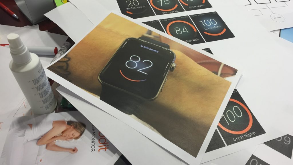
Over the three weeks that we worked together, we produced nearly 100 iterations of the single main screen, vigorously testing how it worked and how it felt like. A few times a week, at the end of the day we did overnight usertesting.com tests to figure out what our users thought of it.
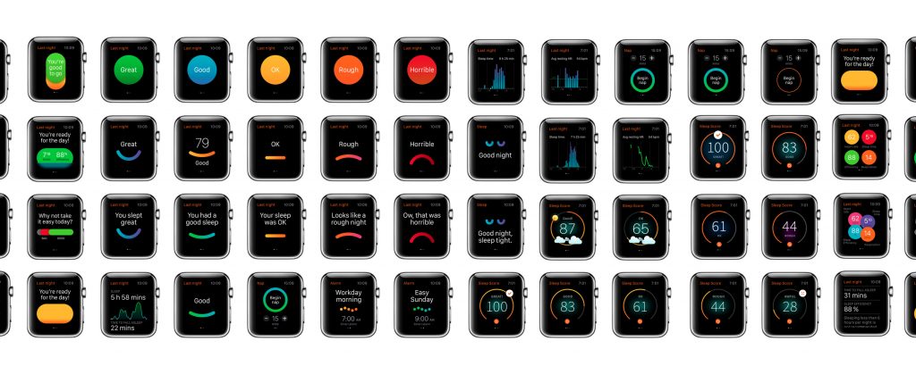
Finally, we arrived at a final set of solutions, of which we chose the winner. The remarkable thing was that we did this together as a team, distributed on both sides of the Atlantic—us in Espoo, others in San Francisco.

While working in double day shifts with transatlantic calls in the evening to finalise the design, we started developing the design. Since we had done motion prototyping on the final 10 or so concepts, the actual design was fairly effortless to finalize at this stage. The final decision was made, and we were ready to ship a few days after the final approval in a call to Cupertino with Apple’s specialists.

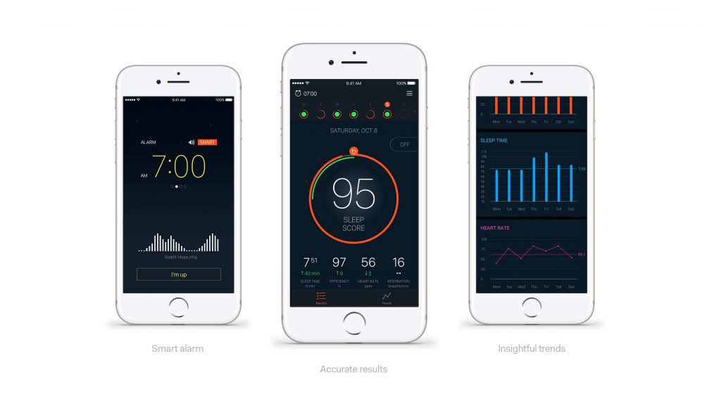
Now that the watch looked beautiful, the original smart phone app started to feel a little worn out. It wasn’t long until we redesigned and refined the app to complement the watch design, and the other way around. This took one more week long sprint, and gave Beddit things to implement for a good few months.

Beddit 3 and the packaging
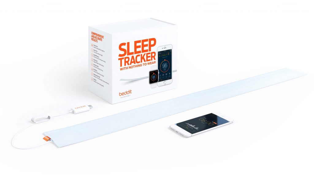
In summer 2016 Beddit was about to launch a new version of their sensor, Beddit 3. In order to live up to the product’s full potential, our team set out to renew Beddit as a consumer product, including nearly everything the customer touches, sees and hears.
On the surface, we began with the obvious—the product itself and how it was packaged. We didn’t set out to do a “brand refresh”, but began to envision a new world class packaging concept that encapsulated Beddit as a brand, as a product and as an experience.
We had two clear goals in mind:
1—We needed to crystallise the Beddit’s story, product purpose, and how it translates to the packaging concept and hierarchy. This would result in the core message that distills the whole story on the cover. What is seen first, when holding the package, after opening it, as well as imagery, text and material choices.
2—We needed to design and produce a new packaging concept that is world-class, that encapsulates the Beddit brand, and stands out in the 200 carefully curated products in Apple Stores around the world.
We started the strategy work by going back to our familiar war room at the Beddit office, and began working in tandem with the necessary people involved. We dove head first into questions like “what is the problem Beddit is actually solving?”, and “why should one measure and track their sleep in the first place?”.
After a few intensive co-creation sessions, the meaning and importance of the product crystallised into a sentence “Sleeping is the bedrock of life. When sleep is solved, everything gets better.”
Solving Sleep. That’s what Beddit is about, as a product itself and also as a company around it. Everything we design, reflects this.
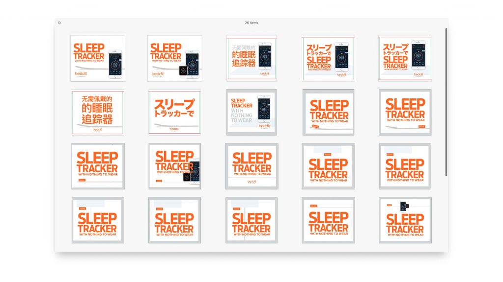
Once the purpose was locked, everything else followed with ease. We delivered the updated packaging in several languages including Chinese and Japanese. As Beddit was given a prime spot at Apple Stores worldwide, we worked out the final details in collaboration with Apple’s visual marketing team in Cupertino.
The Impact
As it often is with long partnership programs, it’s actually quite difficult to point where a project ends and where another one begins. Since 2015, we’ve worked with every single consumer touchpoint of Beddit, together with their internal team, both virtually and physically.
During the past two years we have fully redesigned the UX of the mobile app and the smart watch app, and created the whole UI design framework. The initial spark for that was to create a user interface that simplifies sleep data into a customer friendly format. As the work begun with a smart watch app, the simplifying work resulted in the current version of the Beddit Sleep Score: a clear one number that each morning summarises your previous night. Below the Sleep Score you can always find more detailed information on different sectors of the night.
The key to success was our way of working. We abandoned the traditional restricting mindset of consultants and clients. Instead, we set out to work as a team from day one—a shared space, shared rituals and shared culture, all the way down to mutual lunches and beers, as well as late night calls to sync with the team in California.

At the moment of writing, Nordkapp essentially is Beddit’s elastic design department. We are continuously working on improvements for the application and the product. Here are the individual outcomes of our partnership so far.
Key Figures
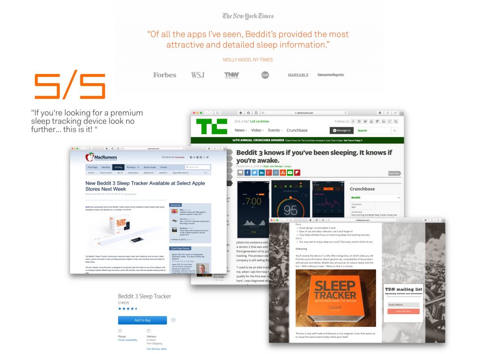
Beddit 3 was released to Apple Stores worldwide, both online and in physical form, in early October 2016. Then it sold out not once but twice before Christmas. We received a lot of positive feedback from the tech press, including Techcrunch, Macrumors and many others. There were several unboxing videos by excited fans and the press.
Beddit got a four-fold increase in their sales through Apple Stores, and in just 12 weeks after launch, Beddit 3 became the most used Beddit product ever.
Get Beddit
→ Download the Beddit App from iTunes
→ Buy the sensor direct from Beddit
→ Buy the sensor from Apple
In Media
→ Unboxing by Triathlon Daily News
→ Beddit 3 announcement at Techcrunch
→ Review at Gadgetflow
→ Beddit 3 announcement at Macrumors
Participating companies:
Client: Beddit
Design: Nordkapp, Beddit
Production: Nordkapp, Beddit
Development: Beddit