Beddit 3 case study
The Beddit 3 is a sleep tracker you don’t have to wear. A hallmark of ambient technology if you will. The way it works is you place the thin, soft sensor under your sheet, plug it in and forget about it. There is nothing to wear or charge, and every night, the sensor automatically measures your sleep, heart rate, breathing, snoring, and bedroom environment, giving you the full picture of the night.
As a company, Beddit is on a mission to Solve Sleep. We have been working with them since their early days, first helping out with some research and then progressing towards an unique way of working built on mutual trust and respect. We work as a single team with a vision built together, shared together, and executed together.
The product
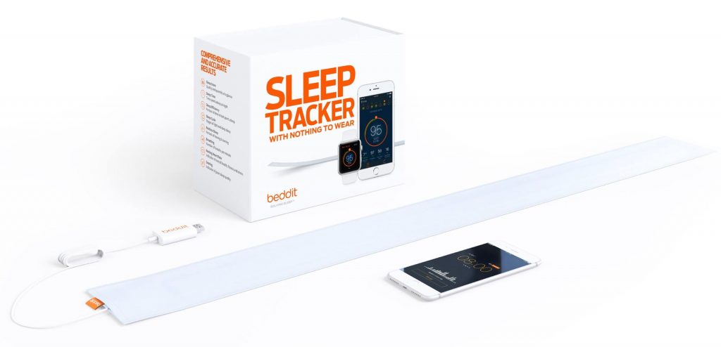
The Beddit 3 as a product consist of the sensor and the application. Place the thin, soft sensor atop your mattress and under your sheet. Plug it into a wall outlet, and it’s always ready to go. Once installed, there is nothing to wear or charge. Every night, Beddit 3 automatically starts measuring your sleep, heart rate, breathing, snoring, and bedroom environment, giving you the full picture of the night.
In the morning you get a comprehensive overview of your night in the Beddit app. Your SleepScore compiles sleep quality and quantity, and the app helps you to understand your sleep patterns — eg. are you getting enough deep sleep? Does it take you long to fall asleep? Are you waking up during the night? Do you snore, and so on. If you happen to travel without your Beddit, the complementary Apple Watch app helps you to stay on top of your sleep.
Sometimes you can’t solve sleep all on your own. That’s why Beddit 3 offers the Beddit Sleep Report. It gives every doctor, therapist, or coach pro-grade insight to help them plan the right move. Similarly, Beddit 3 integrates into most doctor’s EHR system– no paper, no friction as they look up your results. Beddit is also clinically validated of over 99% accuracy against laboratory PSG for our heart rate and respiration measurements has been published in peer-reviewed journals.

Purpose, product first
In summer 2016 Beddit was about to launch a new version of their sensor, Beddit 3. In order to live to the product’s full potential, our team set out to renew Beddit as the consumer product, including nearly everything the customer touches, sees and hears.
On the surface, we started from the obvious — the product itself and how it was packaged. We didn’t set out to do a “brand refresh”, but set out to envision a new world class packaging concept that encapsulated Beddit as a brand, product and an experience. We had two clear goals in mind:
1— To crystallise the Beddit story, product purpose, and how does it translate to packaging concept and hierarchy. This would result into the core message that distills the story on the cover. What is seen first, what is seen when holding the package, what is seen a er opening it, the imagery and text and the material choices.
2— Design and produce a new packaging concept that is world-class, encapsulates the Beddit brand and stands out from Apple Store’s 200 curated products.
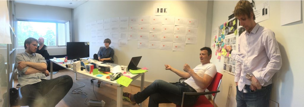
We started the design work by setting up a war room at Beddit premises and started working in tandem with the necessary people. We dove head first into questions like what is the problem Beddit is actually solving, and why should one measure and track their sleep in first place?

The key to success was our way of working. We abandoned the traditional, restricting mindsets of consulting and clients. Instead, we set out to work as a team from day one — shared space, rituals and culture down to mutual lunches and beers, as well as late night calls to sync the team in California, and later Apple’s Watch and Visual merchandising specialists.
After few intensive co-creation sessions the meaning and importance of the product crystallised into a sentence “Sleeping is the bedrock of life. When sleep is solved everything gets better.”
Solving Sleep. That’s what Beddit is about, as a product itself and also the company around it. Everything we design, reflects this.

The packaging
Our goal with the packaging was we wanted it to breathe quality and clarity of the brand, clearly stand out of from the shelves, and also be as easy and simple to use as the product itself.
What was notable is Beddit are the first Finnish consumer product in Apple store’s global distribution, and this set a layer of approvals and advice to the process in between Helsinki and Cupertino. We worked tightly in sync with the local specialists and Chinese factories to deliver the package and the sensor itself. We also had the privilege to work with Apple’s Visual Marketing team in Cupertino to align our work with then just-about-to-be released Apple Store guideline update, first for San Francisco’s Union Square flagship store and later the rest of the world. Having already worked with Apple’s team year before on 2015 Apple Watch launch everything went really smoothly. We were happy to walk them through all details from content to product renderings and such, and make sure everything we did aligned with the big picture. This process also led to the release of the pure white box with orange text to specifically for Apple.
After several rounds of benchmarking and figuring out the narrative of first selecting the product, and then first time use, we settled into a box which would be closed from the side with a hidden magnetic latch. The idea was also to tell a clear narrative from the cover to the sides of what the product is, what it does and how does it work. A great care was put into figuring out how a consumer would experience the product itself at- and after the in-store experience.
The renewed sensor casing itself would be emphasized by putting it into a neat, clean roll under a clear sheet of plastic. The challenge we solved was with a firm structure and right selection of materials was to make the packaging just tight enough to be firm/tamperproof, but easy enough to open without any tools.
This process did lead to the decision in the end have two master versions of the packaging — one, displaying the sensor, app and watch on white background for Apple, because of their requirements, and another, silver plated company purpose on neon orange background on the lid for any other retail outlets to emphasise the boldness of the brand.
All key imaginery was tailored for the product itself. Back cover infographic was shot in a studio on purpose-built bed, while the sensor and material itself was rendered a 3D studio.
The initial master brand packaging as a general consumer version.

The packaging designed for global distribution on Apple Stores adjusts to (then) new guidelines of the renewed stores — Apple’s product benefit first and white as the main color. Due helpful and collaborative visual merchandising team at Apple we managed to still retain Beddit orange in the cover.

Outcomes from smart watch app to a gift bag
As it often is with long partnership programs, it is actually quite difficult to point where a project ends and another one begins. Since 2015, we’re worked with every single consumer touchpoint of Beddit, together with their internal team both virtually and physically.
During the past years we have re-designed the UX of the mobile application and smart watch app and created the UI design framework. The spark for that was to create a user interface that simplifies the sleep data into a customer friendly format. As the work started with smart watch app the simplifying resulted the current version of Beddit sleep score; a clear one number that each morning summarises your night. Below the Sleep Score one can find more detailed information of the different sectors of the night.
At the moment of writing, Nordkapp essentially is Beddit’s elastic design department. We are continuously working on improvements for the application and the product. Here are the individual outcomes of our partnership so far.
TOUCHPOINTS
1—Physical packaging for Apple (white), five language versions including Chinese, Japanese, Korean and a French / English hybrid for Canadian market.
2— Physical packaging (orange).
3— Website and the store
4— iOS App with Apple Watch -extension with redefined Sleep Score
5— Various collaterals
6— Android app (2017)

The ritual and details on how a gift is given defines it’s value. In this case, the bag won’t be an issue.

Localisation adds a layer of variables into the mix. Now we’ll also solve sleep in Japanese.

The Results
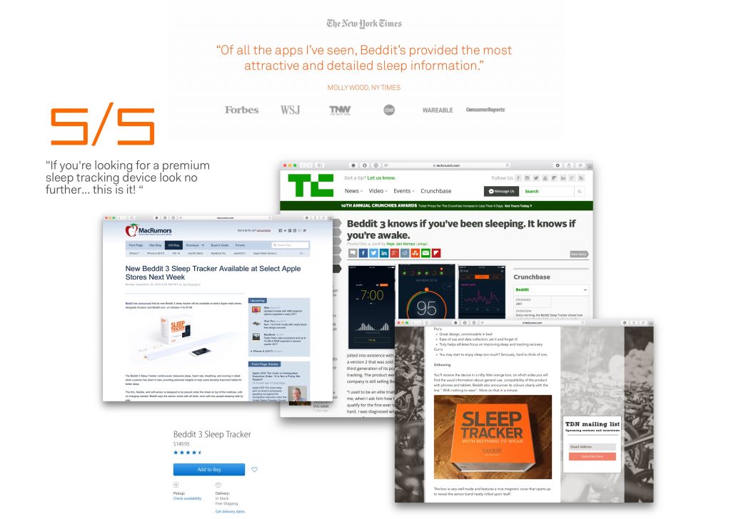
Beddit 3 was released to Apple Stores worldwide both online and physical form in early October 2016. The it sold out not once but twice before christmas. We got a lot of positive feedback from the tech press, including Techcrunch, Macrumors and many others.
Beddit got a 4x increase on their sales via Apple Stores, and in just 12 weeks after lunch Beddit 3 became the most used Beddit product ever.

DOWNLOAD AND BUY
→ Download the Beddit App from iTunes
→ Buy Beddit direct
→ Buy Beddit from Apple
IN MEDIA
→ Triathlon Daily News unboxing and review
→ Beddit 3 @ Techcrunch
→ Review @ Gadgetflow
→ Beddit 3 @ Macrumors

Participating companies:
Client: Beddit
Design: Nordkapp, Beddit
Production: Nordkapp, Beddit
Development: Beddit